Hauptdialog
Box Modell und Colorpicker
Main dialog
box modell and colorpicker
box modell and colorpicker
|
|
Dieser Farbkreis ist nur mit Farbverläufen This color wheel is defined only |
WICHTIG: Es werden nur die Notationen nach CSS3 unterstützt. Dadurch kann es speziell bei den Farbverläufen in Seiten mit den Browser-spezifischen Notationen zu ungewollten Effekten kommen. Bei relativen CSS Selektoren (z. B. #divid img {} oder .div:first-child {} ) werden die zusätzlichen div-Elemente unter Umständen nicht korrekt angezeigt. Es sollten nur id-Selektoren (#divid) oder class-Selektoren (.myclass) verwendet werden.
IMPORTANT: Only the CSS3 notations are supported. This can especially for the color gradients in pages with the browser-specific notations result in unwanted effects. For relative CSS selectors (such as #divid img {} or .div: first-child {}), the additional div elements may not be displayed correctly. Only id selectors (#divid) or class selectors (.myclass) should be used.
WICHTIG: und ... Bei Seiten, die dynamisch verändert werden kann der Frame Designer with Gradients nicht korrekt arbeiten. Die Seiten-Elemente müssen statisch präsent sein und eine definierte Breite und Höhe haben.
IMPORTANT: and ... For pages that are dynamically modified, the Frame Designer with Gradients can not work correctly. The page elements must be statically present and have a defined width and height.
NOCH WAS: wenn man mit lokalen Dateien (html, css) testen möchte, muss man im Firefox bei about:config den Parameter privacy.file_unique_origin=false eingestellt werden.
SOMETHING ELSE: if you want to test with local files (html, css), you have to set the parameter privacy.file_unique_origin=false in about:config in Firefox.
|
1.) |
Zum Starten des Frame Designer with Gradients klickt man auf das Symbol in der Add-on Leiste. To start the Frame Designer with Gradients click on the symbol in the addon bar or in the context menu.
|
2.) |
Neben dem Mauszeiger wird das Element angezeigt, welches unterhalb der Maus liegt. Mit einem weiteren Klick wählt man dieses Element aus, um es zu bearbeiten. Danach öffnet sich der Hauptdialog. Under the mouse pointer appears a symbol, which show the type of element. With a click you can choose the element for editing. After this the dialog window open.
|
|
|
3.) |
Um eine Farbe aus der Web-Seite zu übernehmen, mit der Maus bei gedrückter STRG-Taste zur Stelle gehen und klicken. To pick a color from the web page, press the SHIFT key and click on the color position. |
4.) |
Das CSS Ergebnis liegt im Zwischenspeicher. Im Ergebnis sollten noch Definitionen mit 'unset' oder 'none' entfernt und Pfadangaben angepasst werden. The CSS result is in the clipboard. In the result, definitions with 'unset' or 'none' should be removed and path specifications adjusted. |
--- Erst mal das einfache ---
--- First the simple ---
|
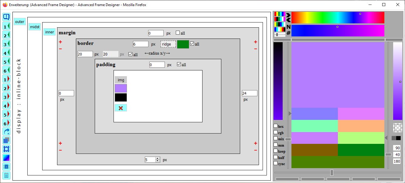
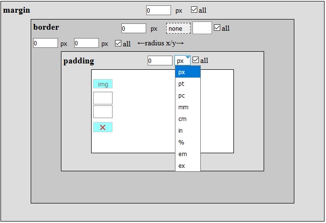
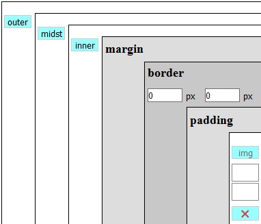
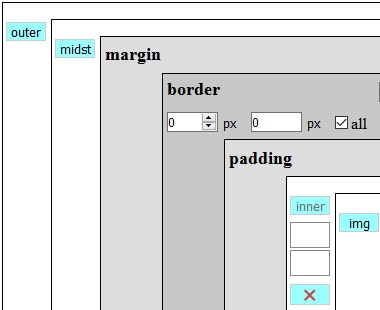
Das Box-Modell bestehend aus margin, border und padding wird in den grau unterlegten Rechtecken dargestellt. Es gehört zu dem ausgewählten Element, welches in der Mitte als inaktive Schaltfläche The Box-Model consists of margin, border and padding is shown in the gray rectangles. It belongs to the chosen element, whose type is in the inactive button Der Rahmentyp (none) ist ebenfalls ein Popup Menü. Beim border kann zusätzlich ein Radius für abgerundete Ecken angegeben werden. Der erste Wert ist für die x-Richtung, der zweite für die y-Richtung. Tippt man beim x-Wert auf die Leertaste, wird der y-Wert mit dem x-Wert gekoppelt. Beide Werte sind dann identisch, grauer Hintergrund. The frame type (none) has a popup menu too. For border you can additional set a radius for rounded edges. First value is for the x-direction the second for the y-direction. If you tap the spacebar in the x-value, the y-value is coupled to the x-value. Both values are then identical, grey background. Wird die Checkbox all ausgeschaltet, so erscheinen die entsprechenden Eingabefelder für die anderen Seiten. Klick man die Checkbox all mit gedrückter SHIFT-Taste, so werden die Werte von top auf alle Seiten übertragen. Is the checkbox all deactivated, the input fields for the other sides are displayed. Do you make a click on the checkbox all while pressing the SHIFT key, the top value is set to all sides. 
Mit den Plus und Minus Zeichen an den Ecken werden die Werte von jeweils zwei benachbarten Seiten erhöht oder erniedrigt. With the plus and minus sign the values of each of two adjacent sides are incremented or decremented. |
|
Auf der linken Seite des Dialogfensters sind Schaltflächen.
Mit der obersten Schaltfläche  werden die Hilfetexte in den Fenstern aktiviert.
Die Schaltflächen mit den Zahlen sind 6 interne Speicherplätze, mit der man die aktuellen Einstellungen speichern  und wieder abrufen
  kann.
kann.
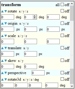
Die Schaltfläche  aktiviert die 'transform' Definitionen.
Die Schaltfläche  aktiviert den Dialog für Schatten.
Die Schaltfläche  aktiviert den Dialog für Border-Image.
Die Schaltfläche  aktiviert den Dialog für Farbverläufe.
Falls bei dem gewählten Element das float Attribut gesetzt ist, wechselt die Schaltfläche  die Position links-zentriert-rechts.
Die Schaltfläche
die Position links-zentriert-rechts.
Die Schaltfläche  aktiviert/deaktiviert die Clipboard Ansicht.
On the left side of the main dialog are buttons.
With the first button you can activate the help text for the dialogs.
The buttons with the numbers are 6 internal memories to temporary save and restore all settings.
The button activate the 'transform' definitions.
The button activate the dialog shadow.
The button activate the dialog border-image.
The button activate the dialog gradients.
If the chosen element has the float attribute set, the button change the position left-center-right.
The button activate/deactivate the clipboard view.
|
--- vorab: Das Hilfesystem --- --- first: The helpsystem --- Nach dem Klick auf die Schaltfläche After clicking on the button --- und: Das Panel in der Web-Seite --- --- and: The panel in the web page --- In der Web-Seite erscheint ein Panel A panel Links im Panel ist eine Checkbox. Wenn diese gesetzt ist, werden alle Dialogfenster in den Vordergrund geholt. On the left of the panel is a checkbox. If this is set, all dialog windows are brought to the front. |
--- Was sollen die Div-Elemente ---
--- Why are the div elements ---
Element
ist aktiv element
is active Um das ausgewählte Element (hier ein image) sind drei Div-Elemente angeordnet, äußeres, mittleres und inneres Div. Diese werden durch die drei Schaltflächen The chosen element (here an image) is wrapped with three div-elements, outer, middle and inner div. These are shown as three buttons Mit den drei Div-Elementen und dem ausgewählten Element können insgesamt 4 Rahmen definiert werden. With the three div elements and the selected element a total of 4 frames can be defined. Das aktive Element erkennt man an der inaktiven Schaltfläche und den darunter stehenden Farbfelder. The active element can be recognized by the inactive button and the color fields underneath. Manchmal passiert es, dass nach dem Einfügen der div-Elemente die Darstellung nicht korrekt ist. Dies kann man mit der Auswahl für die CSS 'display' Angabe im outer-div korrigieren. Sometimes it happens that after inserting the div elements the display is not correct. This can be corrected with the selection for the CSS 'display' specification in the outer div. |
innere div
ist aktiv inner div
is active 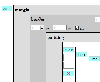
mittlere div
ist aktiv middle div
is active 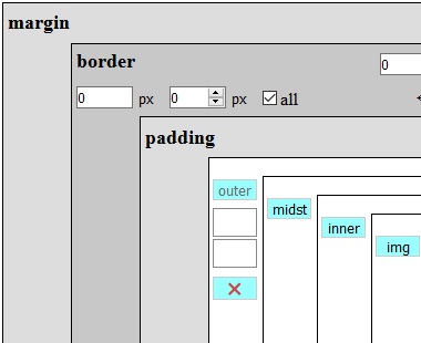
äußere div
ist aktiv outer div
is active |
--- Ein bisschen Farbe ---
--- A little bit of color ---
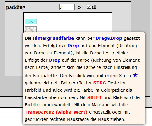
Jedes der 4 Elemente hat eine Vordergrundfarbe, eine Hintergrundfarbe und die Rahmenfarbe. Die Farben werden in Rechtecken angezeigt. Die Farben werden durch Drag&Drop gesetzt. Dies kann man in zwei Richtungen ausführen. Einmal zieht man eine Pickerfarbe zu den Farbfeldern und lässt die Pickerfarbe 'fallen' oder man zieht das Farbfeld zu einer Pickerfarbe und läßt das Farbfeld 'fallen'.
Each of the four elements has a foreground color, a background color and border color. The colors are displayed in rectangles. The colors are set by Drag&Drop. This can be done in two directions. Once you drag a picker color to the color fields and drop the color or drag the color field to the color picker and drop the field.

Im ersten Fall - Pickerfarbe Richtung Farbfeld - wird die Farbe z.B. als Rahmenfarbe gesetzt.
In the first case - picker color to color field - the color is set e.g. set as border color.

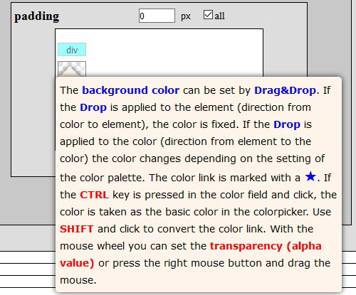
Im Zweiten Fall - Farbfeld Richtung Pickerfarbe - wird eine Verknüpfung zur Farbe hergestellt. Erkennen kann man es an dem Stern ★ im Farbfeld. Eine Verknüpfung bewirkt, dass Änderungen der Farbe im Colorpicker unmittelbar in der Web-Seite sichtbar werden. So lassen sich die Farben fein abstimmen. Mit einem Klick bei gedrückter Shift-Taste wird der momentane Farbwert übernommen.
In second case - color field to picker color - a link to the color is made. You can recognize it on the star in the color field. A link means that changing the color in the color picker will immediately visible in the web page. So the colors can be fine-tuned. With a click while holding the Shift key, the current color value is applied.

Die 'transparente' Farbe wird durch ein Muster dargestellt.
The 'transparent' color is represented by a pattern.


Angezeigt wird die Farbe ohne Alpha-Wert (Transparenz). Mit dem Maus Rad wird die Transparenz verändert. Ist kein Mausrad vorhanden, so kann alternativ mit Klick auf die rechte Maustaste und Ziehen der Maus der Alpha-Wert verändert werden. (wie ein unsichtbarer Schieberegler)
The color is displayed without alpha value (transparency). The mouse wheel changes the transparency. If there is no mouse wheel, alternatively the alpha value can be changed by clicking on the right mouse button and dragging the mouse. (like a hidden slider)
Die Farbe kann temporär mit der Alt Taste und Klick ausgeschaltet werden (OFF). Die Farbe ist dann transparent.
The color can be switched off temporarily with the ALT key and click (OFF). The color is then transparent.
--- Wo sind denn die Farben? ---
--- Where are the colors? ---
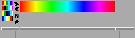
Rechts im Hauptdialog ist der 'Colorpicker'. Beim ersten Aufruf sieht man oben nur ein buntes Regenbogen-Band neben 4 kleine bunte Streifen und schwarze Symbole. Nicht gerade viel.
Right of the main dialog is the 'Color Picker'. At the first time you will see just above a colorful rainbow ribbon next to 4 small colorful stripes and black symbols. Not a lot.
Vorweg ein Hinweis, die Farbbänder reagieren auf Mausbewegung. Ich gebe zu, dass die Bedienung etwas ungewöhnlich ist, vermeidet aber ein langes gedrückt Halten der Maustaste. Auf diese Weise kann man die Maus leicht bewegen und die Farben ausprobieren. Durch Klick schaltet man die Farbbänder weg und kann die Maus wegziehen. Ist die STRG-Taste gedrückt, reagieren die Farbbänder nicht mehr auf Mausbewegung.
First a note, the ribbons respond to mouse movement. I admit that the operation is somewhat unusual, but avoids a long holding down the mouse button. In this way, you can move the mouse slightly and try out the colors. With a click you can switch off the ribbons and can move the mouse. Is the CTRL key pressed there is no longer respond to the ribbons on mouse movement.
Wir bewegen die Maus zum Regenbogenband. Nach einem kurzen Moment reagiert die Maus und die anderen Farbbänder werden aktualisiert. Die Farbe bei der Mausposition, durch ein kleines Rechteck markiert, definiert grob die Ausgangsfarbe. Unter dem Regenbogenband erscheint ein zweites Farbband für die Auswahl der Basisfarbe. Jetzt wechseln wir zu dem Auswahlband und definieren die Basisfarbe (großes Farbfeld).
We move the mouse to rainbow ribbon. After a short moment reacts the mouse and the other color ribbons are updated. The color with the mouse position, marked by a small rectangle, defines roughly the source color. Under the rainbow ribbon the second color ribbon appears for the choice of the base color. Now we change to choice ribbon and define the base color (big color field).
Warum das so gewollt ist, dazu etwas Hintergrundinformation. Es gibt 1530 sogenannte Regenbogenfarben. Das sind die Kombinationen in der RGB-Notation in denen mindestens zwei Werte 0 oder 255 haben und der andere Wert weiter zählt. Die so erzeugten Farben liegen auf den Kanten des RGB-Würfels. Die kleinen bunten Streifen erzeugen unterschiedliche Regenbogenbänder, so dass jede Kante des RGB-Würfels einmal erzeugt wird. Von den Regenbogenfarben werden aus Platzgründen nur jede 5te Farbe im Regenbogen-Band dargestellt. Um auf alle Farben zugreifen zu können, werden alle Regenbogenfarben ausschnittsweise im Farbauswahlband angezeigt.
Why this is so wanted, for that some background information. There are 1530 rainbow colors. These are the combinations in the RGB notation in which at least two values are set 0 or 255 and have the other value counts on. The colors thus produced are the edges of the RGB cube. The small colorful stripes create different rainbow ribbons, so that each edge of the RGB cube is generated once. Colors of the rainbow are represented only every 5th color in the rainbow band to keep space. To access all the colors, all the colors of the rainbow will appear in the fragmentary band color selection.
Mit den 4 bunten Streifen  werden die 4 Regenbogentypen ausgewählt. Und die schwarzen Winkel
  rotieren die Farben innerhalb eines Regenbogenbandes.
With the 4 colored stripes you can choose the 4 rainbow types. And the black arrows let the colors rotate inside the rainbow ribbon.
Das Symbol  zeigt die alphabetisch sortierten Farbnamen, das Symbol
  die Farbnamen nach deren HEX Wert sortiert. Per Klick werden diese im Colorpicker als Basisfarbe übernommen. Hält man die SHIFT Taste gedrückt und klickt auf eine Farbe, werden nur noch die verwandten Farben angezeigt, z. B. alle Blautöne.
The symbol shows the color names sorted by name, the symbol the color names sorted by HEX value. With a click the color is set in the color picker as the basic color. With the SHIFT key pressed and click on a color, only the similar colors are shown, like all blue hues.
Tippt man einen Buchstaben, so werden alle Farben gezeigt, die mit dem Buchstaben anfangen. Zum Beispiel für "r" erscheinen die Farben Red, RosyBrown und RoyalBlue.
If you press a letter, so all colors are shown that start with the letter. For example, for "r" the colors Red, RosyBrown and RoyalBlue appears.
--- Hier wird es jetzt bunt ---
--- Here it is now colorful ---
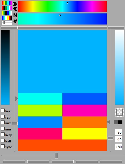
Der Colorpicker ist jetzt mit vielen Farben gefüllt und es gibt recht und links noch zwei weitere Farbbänder. Ausgehend von der im Auswahlband eingestellten Basisfarbe werden links die dunkleren Varianten - Mischung mit Schwarz - und rechts die helleren Varianten - Mischung mit Weiß - dargestellt. Beide Helligkeitsfarbbänder reagieren ebenfalls auf Mausbewegung. Auf diese Weise kann man nur durch Positionieren der Maus und deren Bewegung die Farben variieren ohne die Maustaste gedrückt zu halten.
The Color Picker is now filled with many colors and there are right and left two other color bands. Starting from the color in the selection band you see for the base color left the darker variants - mixed with black - and right the lighter variants - mixed with white. Both brightness ribbons also respond to mouse movement. In this way, you can only by positioning the mouse and there movement vary the colors without holding down the mouse button.
Damit beim Verlassen der Farbbänder die Farbe nicht 'verstellt' wird, können die Farbbänder mit einen Klick ausgeschaltet werden. Ein Klick auf die oberen Farbbänder schaltet alle aus. Ein Klick auf die Helligkeitsfarbbänder nur diese. Zum Einschalten der Farbbänder reicht ein Klick auf die drei grauen Streifen  mit dem weißen Rand. Der mittlere schaltet die oberen Farbbänder wieder ein und die beiden rechts und links die Helligkeitsfarbbänder.
To prevent by leaving the color ribbons that the color changed, the ribbons can be turned off with a click. A click on the ribbons on top turned of all ribbons. A click on the brightness ribbons just this. To activate the ribbons click on the three gray stripes with the white border. The middle activate the top ribbons again and both right and left activate the brightness ribbons.
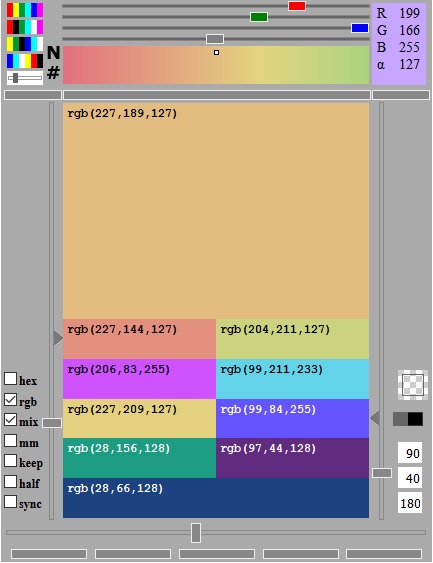
In der Mitte wird ein Block mit 10 Farben angezeigt. Alle diese Farben können per Drag&Drop für die Farbfelder genutzt werden. Was sind dies für Farben und wie entstehen sie. ( -> mousover)
In the middle there is a block with 10 colors. All this colors can with Drag&Drop used for the color fields. What are these colors and how they are produced. ( -> mousover)
(BAS)
(ANA)
(TRI)
(TET)
(SKO)
(KOM)
Um die Abstände einzustellen, gibt es 3 Schieberegler. Der linke ist für die analogen Farben, der rechte für die tetradischen Farben und der untere für die teilkomplementären Farben. Die Werte der Schieberegler werden rechts unten angezeigt, im Bild 90, 40 und 180. Die Schieberegler können mit den Pfeiltasten justiert werden.
To adjust the distances, there are 3 slider. The left is for the analogous colors, the right for the tetradic colors and the lower for the split-complementary colors. The values of the sliders is displayed at bottom right, in the picture 90, 40 and 180. You can adjust the slider with the arrow keys.
Durch Klick auf das grau/schwarze Rechteck  werden die Seiten für die tetradischen Farben getauscht.
With a click on the gray/black rectangle the sides of the tetradic colors are switched.
Das Muster darüber ist eine 'transparente' Farbe  und kann wie eine Farbe benutzt werden.
The pattern above is a 'transparency' color and can be used like the other colors.
--- Jetzt wird es ganz bunt ---
--- Now it's getting more than colorful ---
Ausgehend von den Farben an den Kanten des RGB-Würfels und der Helligkeitseinstellung erhält man nur Farben, die sich auf der Würfeloberfläche befinden. Erkennbar daran, dass einer der RGB Werte immer 255 oder 0 ist.
Based on the colors around the edges of the RGB cube, and the brightness control there are only colors that are on the cube surface. Recognizable from the fact that one of the RGB values is always 255 or 0.
Hier kommt der Farbmischer (3 Schieberegler für rot, grün und blau  ) ins "Farbenspiel". Im Farbmischer wird eine zusätzliche Farbe eingestellt, welche zu der Basisfarbe und deren harmonischen Farben gemischt wird. Das Mischungsverhältnis wird über den Alphakanal (grauer Schieberegler) definiert.
Here comes the color mixer (3 sliders for red, green and blue ) to the "color play". In the color mixer you can set an additional color, which is mixed with the base color and there harmonic colors. The mixing ratio is defined by the alpha channel (gray slider).
Die Mischfarbe wird oben rechts mit den Farbwerten und dem Mischverhältnis (Alphawert) angezeigt.
The mixed color appears at the top right with the color values and the mixing ratio (alpha value).
Mit den Pfeiltasten (rechts, links) können die Farbwerte exakt eingestellt werden.
With the arrow keys (right, left) you can exactly adjust the color values.
Möchte man zwei Farben aus den Farbbändern mischen, stellt man erst die erste Farbe ein. Per Drag&Drop auf das Mixer Farbfeld wird die Farbe auf den Mixer übertragen. Dann stellt man die zweite Farbe mit den Farbbändern ein und setzt die Checkbox mix.
If you want to mix two colors from the coor ribbons, you first set the first color. The color is transferred to the mixer by drag&drop it onto the mixer color field. Then set the second color with the ribbons and set the checkbox mix.
--- Und noch ein paar Einstellungen ---
--- Some more settings ---
Mit den Checkboxen können noch weitere Einstellungen vorgenommen werden.
With the checkboxes you can make more settings.
hex : Zeigt den Farbwert in hexadezimaler Schreibweise
hex : Shows the color value in hexadecimal notation
rgb : Zeigt den Farbwert in rgb Notation (rot, grün, blau)
rgb : Shows the color value in rgb notation (red, green, blue)
mix : Aktiviert den Farbmischer mit der Mischfarbe.
mix : Activate the color mixer with the mix color.
mm : mm steht für Mousemove und deaktiviert die Verzögerung bei der Mausbewegung. Die Verzögerung verhindert, dass bei jedem darüber huschen die Farbeinstellung verändert wird.
mm : mm means mousemove and deactivate the mousemove delay. The delay prevents changing the color directly on moving the mouse over the ribbons.
half : Setzt den Abstand der tetradischen Farben auf die Hälfte des Abstandes der analogen Farben. Der rechte Schieberegler für die tetradischen Farben wird deaktiviert.
half : Set the distance of the tetradic colors to the half distance of the analogous colors. The right slider for the tetradic colors is then deactivated.
syc : Synchronisiert den Abstand der analogen Farben und der teilkomplementären Farben. Der untere Schieberegler für die teilkomplementären Farben wird deaktiviert.
syc : Synchronize the distance of the analogous colors and the split-complementary colors. The lower slider for the tetradic colors is then deactivated.
keep : Das mit dem Frame Designer with Gradients erzeugte Design bleibt temporär in der Web-Seite erhalten. Nach einem Neuladen der Web-Seite sind die Einstellungen weg.
keep : With the Frame Designer with Gradients build design keeps temporary in the web page. After reloading the web page, the settings are gone.
Am unteren Rand sind weitere 5 Schaltflächen  , mit denen nur bestimmte Farben angezeigt werden (von links nach rechts).
At the bottom are another 5 buttons , which only show certain colors (from left to right).
--- Manchem ist 1 Schatten zu wenig ?!! ---
--- For some persons is 1 shadow not enough ?!! ---
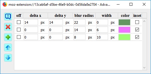
Eine Schattendefinition besteht aus mehreren Werten. Aber, es können mehrere sich überlagernde Schatten definiert werden. Hierbei wird zusätzlich nach Schatten, die nach außen und nach innen gerichtet sind, unterschieden. Die Werte eines Schatten sind:
A shadow definition consists of multiple values. But, there may be several overlapping shadows are defined. The shadow are additional differentiate over the direction, outset and inset. The values of a shadow are:
Mit der Schaltfläche  wird eine neue Schattendefinition in der Liste angelegt.
With the button you can create a new shadow in the list.
Mit der Schaltfläche  wird die aktuelle Schattendefinition in der Liste nach oben geschoben.
With the button you can move the selected shadow one line up in the list.
Mit der Schaltfläche  wird die aktuelle Schattendefinition in der Liste nach unten geschoben.
With the button you can move the selected shadow one line down in the list.
Die Schaltfläche  löscht die aktuelle Schattendefinition, wenn die Checkbox off aktiviert wurde.
The button delete the selected shadow, if the checkbox off is active.
--- Es wird komplizierter ---
--- It becomes more complicated ---
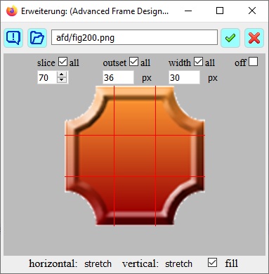
Für den Rahmen kann man ein Bild nutzen. Dieses Bild wird in der horizontalen und vertikalen Richtung jeweils in drei Teile zerlegt. Auf diese Weise ergeben sich neun Teile. Die Eckteile werden den Ecken des Rahmens zugeordnet, die Seitenteile den entsprechenden Seiten des Rahmens. Das Mittelteil wird zum Füllen benutzt. Soweit die Theorie.
For the frame, you can use an image. This image is divided in the horizontal and vertical direction, respectively in three parts. In this way, nine parts are the result. The corner parts are assigned to the corners of the frame, the side parts of the corresponding sides of the frame. The middle part is used for filling. That is the theory.
Im Borderimage Dialog sieht man das Bild, welches durch den slice Parameter zerlegt wird. Der slice Parameter gibt den Abstand vom benachbarten Rand an. Die farbigen Linien geben die slice Position an. Falls sie schlecht zu erkennen sind, kann man durch Klick die Farbe wechseln.
In the borderimage dialog you can see the picture, which is divided by the slice parameter. The slice parameters are the distances from the adjacent edge. The colored line shows the slice position. If they are hard to see, you can change the color by clicking.
Der outset Parameter verschiebt den Rahmen nach außen und der width Parameter gibt die Breite des Rahmen an. Die Ecken- und Seitenteile werden an die Rahmenbreite angepasst.
The outset parameter moves the frame outside and the width parameter set the width of the frame. The corner parts and side parts are matched to the frame width.
Die Checkboxen all funktionieren hier entsprechend wie im Box-Modell.
The checkboxes all work here like in the box-model.
Die Parameter horizontal und vertical können mit den Menüs eingestellt werden. Sie geben an, wie die Seitenteile dem Rahmen angepasst werden. Die Checkbox fill füllt das Zentrum mit dem Mittelteil des Bildes.
The parameters horizontal and vertical can be set with the menus. You specify how the side parts are adapted to the context. The checkbox fill fills the center with the center part of the image.
Bei Mausberührung bekommt das rechte Bild einen Rahmen mit einem borderimage.
When you touch the right picture with the mouse, the picture gets a frame with a borderimage.
Mit  kann man eine lokale Datei für ein Borderimage auswählen.
With you can choose a local filefor a borderimage.
In das Eingabefeld kann man den Namen einer Borderimage-Datei auf dem Server eingeben und mit  bestätigen.
In the input field you can enter the name of a borderimage file on the server and confirm with .
Das entfernt das Borderimage.
The removes the borderimage.
ACHTUNG: Wird beim Parameter width die Einheit * (stern = ohne Einheit) eingestellt, so ist der Wert von width ein Faktor, der mit der Rahmenbreite im Box-Modell multipliziert wird. Das Ergebnis wird im Tooltip der width Textbox angezeigt. Mit border-width = 20px und width = 3* ergibt sich für width effektiv 60px. Wirksam wird die berechnete Breite nur, wenn ein Borderstyle angegeben ist, z. B. solid. Bei Parameter slice bedeutet die Einheit px 'ohne Einheit', sind aber implizit Pixel (px).
ATTENTION: Did you set on parameter width the unit * (star = no unit), the value of width is a factor, which will be multiplied with the frame width form the box-model. The result you can see in the tooltip width. With border-width = 20px and width = 3* the result is for width is 60px. The calculated width is only effective if a border style is specified, e.g. solid. If parameter slice has 'no unit', the unit is implicitly pixel (px).
HINWEIS: Beim Borderimage Dialog wird das Image automatisch im Addon geladen. Das funktioniert bei Dateien, welche im Internet gespeichert sind. Wird eine lokale Seite mit lokalen Images aufgerufen, wird das Laden der Images ins Addon vom lokalen Rechner aus Sicherheitsgründen verhindert. Das nachträgliche Laden des Borderimage vom lokalen Rechner durch eine 'User Aktion' ist aber möglich, z. B. Klick auf Button.
COMMENT: The Border Image dialog automatically loads the image in the addon. This works for files stored on the Internet. If a local page is called with local images, loading the images into the addon from the local machine is prevented for security reasons. The subsequent loading of the borderimage from the local computer by a 'user action' is possible, e.g. click on button.
--- Kompliziert ist ab jetzt untertrieben ---
--- Complicated is an understatement from here now ---
Als Alternative zur Hintergrundfarbe und Hintergrundbildern kann man Farbverläufe definieren. Aus den Definitionen der Farbverläufe wird im Prinzip ein Hintergrundbild berechnet. Auf die Regeln möchte ich hier nicht eingehen.
As an alternative to the background color and background picture you can define gradients. From the definitions of the gradients, a background image is calculated. To the rules, I will not go into here.
Der Dialog Gradient (Farbverläufe) besteht aus den Teilen:
The Dialog Gradient consists of the parts:
Auffällig ist, dass es für die Farbverläufe eine Liste gibt. Grund ist, man kann mehrere Farbverläufe definieren kann, die sich dann überlagern. Klingt im ersten Moment einfach, aber man muss einiges dabei beachten. Und das lässt sich leider nicht in Tooltips unterbringen.
It is striking that there is a list for the gradients. Reason is, you can define multiple gradients, which are then overlapping. Sounds easy at first, but you have several things to consider here. And that can not be accommodated in tooltips.
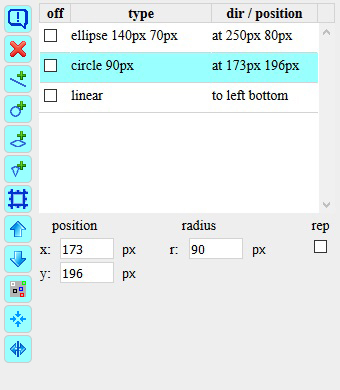
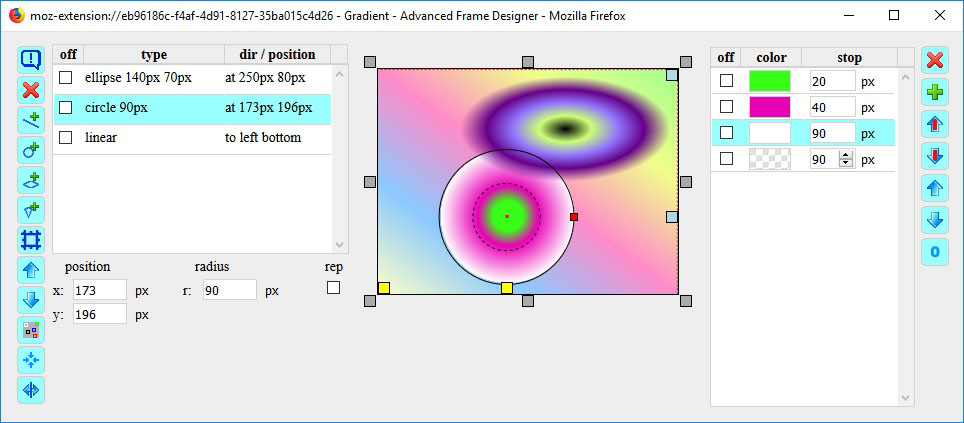
Es gibt 8 verschiedene Typen von Farbverläufe: linear, repeating-linear, circle, repeating-circle, ellipse, repeating-ellipse, conic, conic-repeating.
There are 8 kinds of gradients: linear, repeating-linear, circle, repeating-circle, ellipse, repeating-ellipse, conic, conic-repeating.
Mit den Schaltflächen  ,
,  ,
,  ,
,  werden die Farbverläufe erzeugt. Mit der Checkbox rep werden die Repeat Varianten aktiviert.
With the buttons , , , you can create the gradients. With the checkbox rep the repeat variants are activated.
Mit der Schaltfläche wird die aktuelle Definition dem Rahmen zugeordnet als Ersatz für ein Borderimage. Die Checkbox fill im Borderimage-Dialog sollte aus sein.
The button will assign the current definition to the border as a substitute for a borderimage. The checkbox fill in the borderimage dialog should be set to off.
Mit der Schaltfläche wird die aktuelle Definition in der Liste nach oben geschoben.
With the button you can move the selected gradient.
Mit der Schaltfläche wird die aktuelle Definition in der Liste nach unten geschoben.
With the button you can move down the selected gradient.
Die Schaltfläche löscht die aktuelle Definition.
The button delete the selected gradient.
Die Schaltfläche  ändert die Farbe der Marker. Mit gedrückter SHIFT-Taste werden die Marker im Vorschaufeld ein-/ausgeblendet.
The button changes the color of the marker. With SHIFT-key pressed the marker in the preview box are switch on/off
Die Schaltfläche  setzt den Kreis oder die Ellipse zentriert zurück. Dies ist machmal nützlich, wenn der Kreis/die Ellipse zu groß geworden ist oder die Position weit außerhalb des Feldes liegt.
the button reset the circle and ellipse in the center. This is sometimes useful if the circle / ellipse has become too large or the position is far outside the field.
Die Schaltfläche  zeigt zusätzliche Felder.
The button displays additional fields.
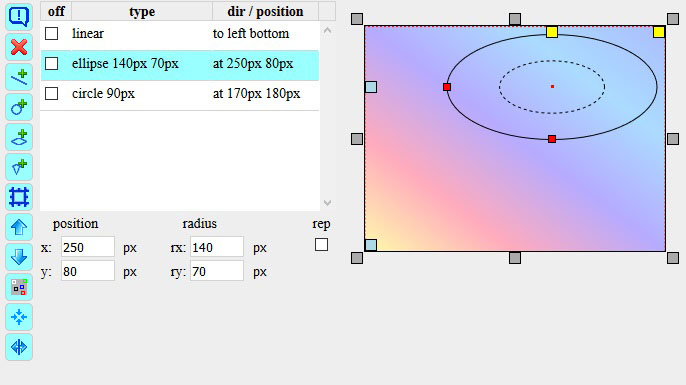
In der Liste werden die Hauptparameter eines Farbverlaufes angezeigt:
The list shows the main parameters of the gradient:
Unterhalb der Liste erscheinen die Parameter entsprechend dem Farbverlaufstyp. Beim Typ linear gibt es den Winkel (angle). Vorab ein Wort zu den Einheiten. Die Einheit - (minus) steht für Parameterwert ist nicht relevant. Der Gradient Typ conic hat auch einen Winkel und zusätzlich eine X- und Y-Position. In der Vorschau wird mit der Maus außerhalb des Kreises der Winkel eingestellt und innerhalb des Kreises die Position. Der virtuelle Drehpunkt für die Einstellung des Winkels mit der Maus ist der Vorschaumittelpunkt. Die grauen Marker am Vorschaufeld stellen den Winkel zu den Seiten und Eckpunkten ein. Bei gedrückter SHIFT-Taste wird der Gradient auf die Seiten und Ecken gesetzt.
Below the list appear the according parameters of the gradient type. Type linear has an angle (angle). First a word to the units. The unit - (minus) means parameter value is not relevant. The gradient type conic also has an angle and an additional X and Y position. The virtual pivot for adjusting the angle with the mouse is the preview center. In the preview, use the mouse outside the circle to set the angle and inside the circle the position. The gray markers round the preview box set the angle to the sides and corners. With the SHIFT key pressed, the gradient is set to the sides and corners.
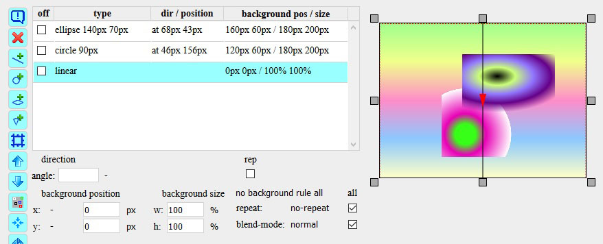
Für besondere 'Konstruktionen' werden noch weitere CSS-Parameter benötigt
For special 'constructions' other CSS parameters are still needed
Diese werden mit der Schaltfläche sichtbar. In der Liste erscheinen die Spalten background position, background size, repeat, blend-mode und ein rule (Regel) Feld:
These are shown by this button . In the list appears the column background position, background size, repeat, blend-mode and a rule field:
*** Das bedeutet, keine Positionen außerhalb der Elementgrenzen und die Größe wird so angepasst, dass der Hintergrund nicht außerhalb des Elementes liegt.
*** This means that there are no positions outside the element boundaries and the size is adjusted so that the background does not fall outside the element.
--- Erst einmal die Bedienungselemente ---
--- First the controls ---
Das Vorschaufeld wird entsprechend den Dimensionen des in der Web-Seite ausgewählten Elementes skaliert.
The preview box is scaled by the dimensions of the element in the web page.
Um das Vorschaufeld sind an den Seiten und Ecken graue Marker  . Ein Klick auf einen grauen Marker positioniert den Farbverlauf bzw. bestimmt die Richtung. Die entsprechenden Schlüsselworte sieht man in der Liste der Farbverläufe.
Round the preview box there are gray marker on the sides an the corners. A click on a gray marker positioned the gradient or defined the direction. The corresponding keyword you see in the gradient list.
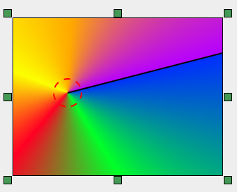
Beim Farbverlauf linear erscheint ein Richtungsmarker (Pfeil mit Linie). Wenn für den Winkel eine Einheit gewählt ist, reagiert der Richtungsmarker auf Mausbewegung und man kann so den Winkel einstellen.
For the gradient linear you see a direction marker (arrow width line). If a unit is set for the angle, the direction marker reacts to the mouse to adjust the angle.
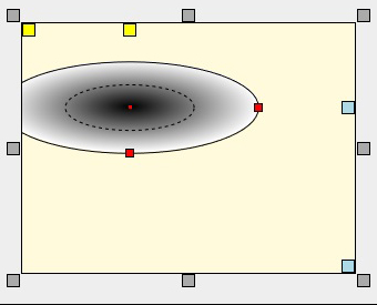
Bei dem Farbverlauf ellipse wird die Ellipse dargestellt und zur Orientierung die 50% Ellipse sowie weitere Marker. Die gelben Marker  im Vorschaufeld positionieren die Ellipse an der nächsten Seite oder der nächsten Ecken, die bläulichen Marker
  die am weitesten entfernte Seite oder Ecke. Durch Klick auf einen Marker wird Position und Größe eingestellt.
For the gradient ellipse you see an ellipse and for the orientation a second ellipse in the 50% distance and additional marker. The yellow marker in the preview box positioned the ellipse to the closest or farthest side, the blue marker to the closest or farthest corner. With a click on a marker you can set the position and the size.
Die Marker auf der Ellipsenlinie sind der x-Radius und der y-Radius. Durch ziehen mit der Maus wird die Größe eingestellt. Ebenso kann die Ellipse mit der Maus verschoben werden (klick, halten und schieben). Beim Kreis fehlt nur der Marker für den y-Radius. Der Mittelpunkt sind die Parameter x und y Koordinaten.
The marker on the ellipse line are for the x-radius and the y-radius. With dragging by mouse you can set the size. Also you can move the ellipse by mouse (click, hold and move). The circle has only a marker for the y-radius. The center are the parameter x and y coordinates.
Der Farbverlauf conic hat auch einen Winkel und zusätzlich eine X- und Y-Position. In der Vorschau wird mit der Maus außerhalb des Kreises der Winkel (schwarze Linie) eingestellt und innerhalb des Kreises die Position. Die grünen conic Marker  am Vorschaufeldrand stellen den Winkel zu den Seiten und Eckpunkten ein. Bei gedrückter SHIFT-Taste wird das Zentrum auf die Seiten und Ecken gesetzt.
The gradient type conic also has an angle and an additional X and Y position. In the preview, use the mouse outside the circle to set the angle (black line) and inside the circle to set the position. The green conic markers round the preview box set the angle to the sides and corners. With the SHIFT key pressed, the center is set to the sides and corners.
--- was kann man sehen - oder auch nicht - und warum ---
--- what can you see - or even not - and why ---
Wie der Name schon sagt, wird hier gemäß Liste das Farbresultat aller aktuellen Farbverläufe des Elementes angezeigt. Dies ist einfach gesagt, aber was steckt dahinter. Wenn es z.B. drei Farbverläufe gibt, dann werden im Prinzip alle drei angezeigt. Für den in der Liste aktuellen Farbverlauf werden die Hilfselemente eingeblendet.
As the name suggests, the result of all the color gradients of the element is displayed according to the list here. This is easy to say, but what's behind it. If for example there are three gradients, then they are displayed in principle all three. For the current gradient in the list, the auxiliary elements are displayed.
In dem Beispiel gibt es ein Farbverlauf linear, einen vom Typ circle und einen vom Typ ellipse. Zu sehen ist der Farbverlauf linear. Vom Farbverlauf ellipse werden die Marker angezeigt, weil dieser ausgewählt wurde. Vom Farbverlauf circle sieht man nichts. --- warum --- Der Farbverlauf linear steht in der Liste an erster Position und verdeckt die beiden anderen. Die Farbverläufe müssen in die richtige Reihenfolge gesetzt werden und die 'transparente' Farbe ist zu aktivieren.
In the example there is a gradient linear one with type circle and another with type ellipse. You can see the gradient linear. Fram the gradient ellipse you see the markers because it was selected. But you can see nothing from the color gradient circle. --- why --- The gradient linear is first in the list and covers the other two. The gradients must be set in the correct order and the 'transparent' color must be activated.
Hierbei ist die Spalte off sehr nützlich. Durch setzen der Checkbox können die Farbverläufe deaktiviert werden.
The column off is very useful here. By setting the checkbox, the color gradients can be deactivated.
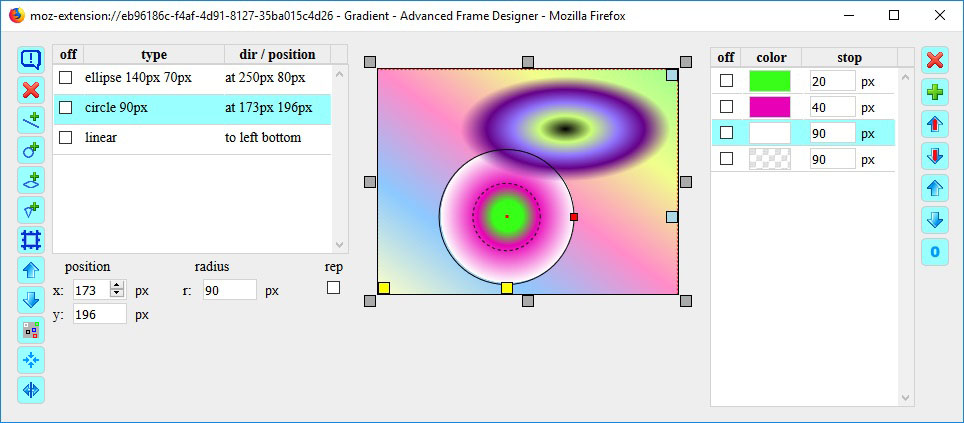
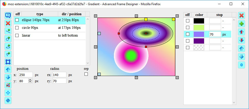
In der Liste habe ich die Farbverläufe in die richtige Reihenfolge gebracht und die 'transparenten' Farben aktiviert. Jetzt ist der Farbverlauf linear im Hintergrund und die Farbverläufe circle und ellipse im Vordergrund.
I put the gradients in the list to the right order and activate the 'transparent' color. Now the gradient linear is in the background and the gradients circle and ellipse are in the foreground.
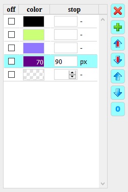
Der Farbverlauf circle liegt hinter dem Farbverlauf ellipse. Die Farbe Blau des colorstops vom Farbverlauf circle hat den Wert des Radius. Die nachfolgende Farbe ist transparent mit colorstop 90px. Damit endet die Farbe exakt am Radius und außerhalb des Radius ist die Farbe 'transparent'.
The gradient circle is behind the gradient ellipse. The color blue of the color stop of the gradient circle has the value of the radius. The following color is transparent with colorstop 90px. So the color ends exactly at the radius and outside the radius the color is 'transparent'.
Der Farbverlauf ellipse (mouse over) hat bei Farbe 'orange' den colorstop 70px, die Hälfte vom Radius. Deshalb liegt die Farbe exakt auf dem Marker '50% Ellipse'. Die anderen Farben werden gleichmäßig verteilt.
The color gradient ellipse (mouse over) with color 'orange' has the colorstop 70px, half of the radius. Therefore, the color is exactly on the marker '50% ellipse'. The other colors are equally distributed.
Die Farbdefinitionen werden in einer Liste bearbeitet. Mit dem Anlegen eines neuen Farbverlaufs werden auch drei Farben erzeugt. Ein Farbverlauf benötigt mindestens zwei Farben. Die dritte Farbe ist eine deaktivierte 'transparente' Farbe, welche immer bei Überlagerungen benötigt wird und dann aktiviert werden kann.
The color definitions are processed in a list. By creating a new gradient, three colors are produced. A gradient requires at least two colors. The third color is a disabled 'transparent' color, which is always required in overlapping and can then be activated.
An der stop Position einer Farbe hat die Farbe ihre volle Intensität. Im Bereich zwischen zwei Farben werden die Farben gleichmäßig überblendet (gemischt). Ohne Wert hat die erste Farbe 0% und die letzte Farbe 100%. Die stop Werte sollten aufsteigen sein, sonst gibt es keine Übergänge. Die letzte Farbe definiert auch den Bereich außerhalb eines circle oder ellipse Farbverlaufs und deckt somit andere Definitionen ab. Deshalb sollte die letzte Farbe dann eine 'transparente' Farbe sein.
At a stop position of a color, the color has its full intensity. In the area between two colors, the colors are evenly blended (mixed). Without value, the first color is 0% and the last color 100%. The stop values should be ascending, otherwise there are no transitions. The last color also defines the region outside a circle or ellipse gradient and thus covers other definitions. Therefore, the final color should then be a 'transparent' color.
Mit der Schaltfläche wird eine neue Farbdefinition in der Liste angelegt.
Mit der Schaltfläche wird die aktuelle Farbdefinition in der Liste nach oben geschoben.
Mit der Schaltfläche wird die aktuelle Farbdefinition in der Liste nach unten geschoben.
Mit der Schaltfläche  wird nur die Farbe der aktuellen Farbdefinition in der Liste nach oben geschoben. **
Mit der Schaltfläche  wird nur die Farbe der aktuellen Farbdefinition in der Liste nach unten geschoben. **
Die Schaltfläche löscht die aktuelle Farbdefinition, wenn die Checkbox off aktiviert wurde.
Mit der Schaltfläche  werden alle stop Werte auf 'keine Angabe' Einheit '-' gesetzt.
** Dadurch bleibt die Reihenfolge der colorsop Positionen erhalten. Für einen Farbverlauf müssen die colorstop Werte aufsteigend sortiert sein.
With the button a new color definition is created.
With the button the selected color definition is moved up.
With the button the selected color definition is moved down.
With the button only the color of the selected color definition is moved up. **
With the button only the color of the selected color definition is moved down. **
The button delete the selected color definition, if the checkbox off is active.
The button set all stop values to 'no value' unit '-'.
** This keeps the order of the colorsop positions. For a gradient, the colorstop values must be sorted in ascending order.
--- Tipps ---
--- Tips ---
<div id="1"> <p id="2"></p> <div id="3"> <a id="4"></a"> <p id="5"> <img id="6"> <div id="7"></div> </p> </div> </div> |
Möchte man ein DIV-Element auswählen, das man mit der Maus nicht 'erwischen' kann, weil es überlagert wurde, kann man im ElementBaum mit SHIFT-Taste, STRG-Taste und ALT-Taste navigieren. Ist die Maus bei Element 7, so erhält man mit:
If you want to choose a DIV element that you are not able to 'catch' with the mouse, because it is overlaped, you can navigate in the element tree with SHIFT-Taste, STRG-Taste und ALT-Taste,
|
Ein Klick auf die Icons im Dialog öffnet die Dialoge (Schatten, Gradienten). Wenn der Dialog bereits geöffnet ist, wird der Dialog durch Klick in den Vordergrund gebracht.
A click on the icon in the dialog opens the dialogs (shadows, gradients). When the dialog is already open, the dialog is placed by clicking in the foreground.
Um das gewählte Element, für das man einen Rahmen erstellen möchte, werden drei zusätzliche div Elements gesetzt. Wenn diese anschließend in der Webseite verwendet werden oder bereits implementiert wurden, müssen die Div-Elemente den Klassennamen hjbddorfkeepdesign erhalten. Über den Klassennamen erkennt der Frame Designer with Gradients die div-Elemente und übernimmt deren Style-Parameter.
Around the selected item for which you want to define a frame, three additional div elements are created. If these are subsequently used in web page or have already been implemented, the Div elements must get the class name hjbddorfkeepdesign. Via the class name the Frame Designer with Gradients detects the div elements and takes over their style parameters.
<div id="outerdiv" class="outer hjbddorfkeepdesign"">
    <div id="middlediv" class="middle hjbddorfkeepdesign">
        <div id="innerdiv" class="inner hjbddorfkeepdesign">
            <img id="foto" src="../hobby/hortensie.jpg" width="350" height="233" alt="testbild">
        </div>
    </div>
</div>
Ist eine Farbdefinition per Verweis eingestellt (gekennzeichnet mit ★ ) und die Farbe soll fixieren werden, klickt man mit gedrückter SHIFT-Taste auf das Farbfeld. Die Farbe ist dann fest eingestellt. Mit der STRG-Taste und Klick auf das Farbfeld wird die Farbe im Colorpicker als Basisfarbe übernommen.
If a color definition is set by reference (indicated by ☆) and you want the color to fix, you click while holding down the SHIFT key on the color field. The color is then fixed. With the CTRL key and clicking on the color field, the color is taken over in the colorpicker as base color.
Die Farbbänder reagieren auf Mausbewegung mit einer Verzögerung. Um die Farben nicht ungewollt zu verändern, sollte man die Maus zügig über die Farbbänder bewegen. Hat man trotzdem Probleme, kann die Reaktion bei Mausbewegung durch gedrückt halten der STRG-Taste unterbunden werden oder man schaltet die Farbbänder aus.
The ribbons react on mouse movement with a delay. To avoid unintentionally changing the colors, you should move the mouse quickly over the ribbons. If you still have problems, the reaction can be suspend by holding down the CTRL key. Or you can turn off the color bands by click.
Das letzte Farbband mit Mausbewegung reagiert auf die Pfeiltasten. Das Farbauswahlband auf rechts und links, die beiden Helligkeitsbänder auf hoch und runter.
The last color ribbon you touch with the mouse reacts on the arrow keys. The color selection ribbon on right and left, the both brigthness color ribbons on up and down.
Wenn falsche Farben angezeigt werden, ist vermutlich die Checkbox mix an. Bei den Farbverläufen ist nicht der richtige Farbverlauf aktiviert oder wird überlagert oder es fehlt die Tansparenz.
If wrong colors are displayed, the checkbox mix is probably on. Gradients do not have the correct gradient selected or is overlapped or there is no transparency.
Die Schieberegler werden mit der Maus eingestellt. Für jeden Schieberegler wird der aktuelle Wert angezeigt. Die Werte können auch mit den Pfeiltasten eingestellt werden.
The slider can be adjusted with the mouse. For each slider, the current value is displayed. You can adjust the values with the arrow keys.
Bei den Schatten ist auf die richtige Reihenfolge zu achten. Sonst wird ein Schatten von einem anderen überlagert.
For the shadow ensure that they are in the correct order. Otherwise a shadow is overlaid by another.
Wenn nichts zu sehen ist, dann ist der Wert für width 0 oder der Wert für outset ist zu klein.
If you see nothing, then the value for width is 0 or the value for outset is too small.
Testet man mit lokalen Bildern, so muss die CSS-Definition nachbearbeitet werden. Das Bild wird in der 'base64' Notation eingebunden. Alternativ kann ein vorhandenes Bild vom Server geladen werden. Die Pfadangabe ist relativ zur Webseite.
If you test with local images, so the CSS definition must be edited. The image is included in the 'base64' notation. Alternatively, an existing image can be loaded from the server. The path is relative to the website.
Wenn der Winkel nicht mit der Maus eingestellt werden kann, fehlt die Einheit des Winkels.
If you can not adjust the angle with the mouse, the unit of the angle is missing.
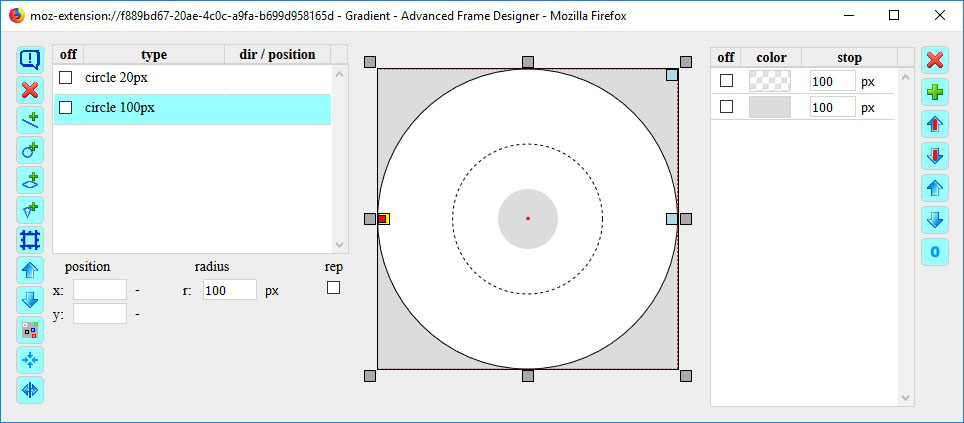
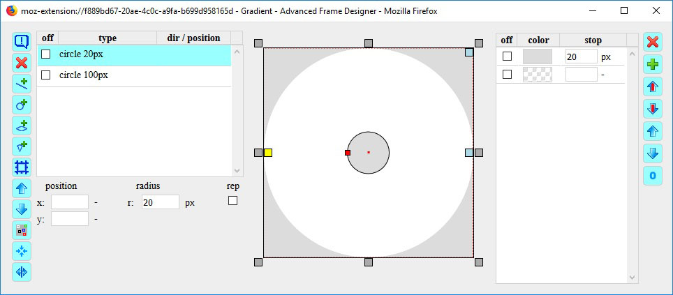
Bei Überlagerung ist auf die richtige Reihenfolge zu achten und als letztes die 'transparente' Farbe zu aktivieren. Will man eine scharfe Abgrenzung erreichen, z.B. bei einem Kreis, ist der Wert des Radius x gleich dem stop Wert der letzten Farbe (nicht transparent) zu setzten. Das bedeutet, der Kreis hat einen Radius von z.b. 100px und die letzte Farbe endet bei 100px. Ab da wirkt die transparente Farbe.
For overlay is to ensure the correct order and to activate finally the 'transparent' color. If you want to reach a sharp demarcation, for example, in a circle, the value of the radius x is equal to stop value of the last color (not transparent). This means that the circle has a radius of, e.g., 100px and the last color stops the position 100px. From that affects the transparent color.
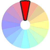
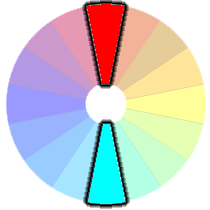
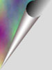
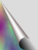
Der Farbkreis besteht aus zwei ineinander verschachtelte DIV Elemente. Das innere DIV Element hat zwei Kreise. Der kleine deckt den Mittelpunkt ab und der große sorgt für den Rand. Das äußere DIV Element hat den class Namen hjbddorfkeepdesign, damit dessen CSS Definition mit bearbeitet werden kann.
The color wheel consists of two nested DIV elements. The inner DIV element has two circles. The little covers the center and the large covers the edge. The outer DIV element has the class name hjbddorfkeepdesign thus its CSS definition can be worked with.
Der kleine Kreis liegt im Vordergrund und der große im Hintergrund. Die Reihenfolge der Farben ist im großen Kreis transparent, Hintergrundfarbe deckt den äußeren Teil ab. Im kleinen Kreis ist die Reihenfolge Hintergrundfarbe, transparent. Somit bleibt der Farbring übrig.
The small circle is in the foreground and the large in the background. The order of the colors is in the large circle transparent, background color covers the outer part. In a small circle the order is background color, transparent. Thus, the color ring remains.
Wird der Farbkreis in der Webseite ausgewählt, so findet man der Farbkreis im box modell beim inner div. Das ausgewählte Elemen im box model ist das div mit den grauen Kreisen.
If the color wheel is selected in the web page, you will find the color wheel in the box model in the inner div. The selected element in the box model is the div with the gray circles.
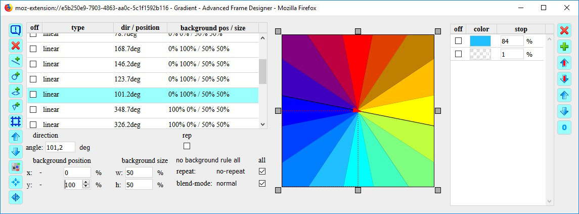
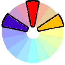
Das äußere DIV Element enhält die 16 Farben und erscheint im Dialog Box-Modell beim inner Div. Jede Farbe besteht aus einem linear Farbverlauf. Um die Farben im Kreis anzuordnen, benötigt man die Zusatzparameter. Die Breite (w) und die Höhe (h) des Hintergrundes wird auf 50% eingestellt. Damit werden die Farbverläufe für ein viertel Hintergrund definiert. In diesen viertel Hintergrund werden linear Farbverläufe angelegt, die mit der richtigen Reihenfolge und Farbe die Segmente erzeugen. Die Segmente in den anderen Vierteln werden über die x Werte und y Werte in die anderen Viertel verschoben.
The outer DIV element contains the 16 colors and appears in the box model dialog at inner Div. Each color consists of a linear gradient. To arrange the colors in a circle, you need the additional parameter. The width (w) and the height (h) of the background is set to 50%. Thus, the gradients are defined for a quarter background. In these quarter background the linear gradients are created with the segments in the correct sequence and color. The segments in the other quarters are moved over the x values and y values in the other quarters.
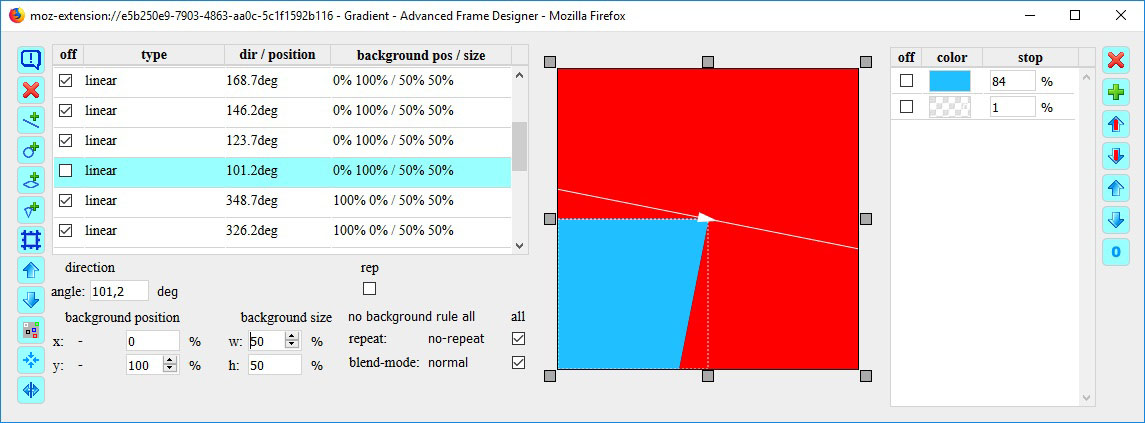
Im 'mouseover' Bild sind alle Farbverläufe ausgeblendet bis auf einen. Die anderen überlagern diese oder sind im Hintergrund. Der letzte Farbverlauf ist ein waagerecht zentriertes Rechteck und füllt so das übrig gebliebene Segment mit Farbe. Das obere rote Segment wird durch die Hintergrundfarbe gefüllt.
In the 'mouseover' image all color gradients are hidden except for one. The others overlay them or are in the background. The last gradient is a horizontally centered rectangle, filling the leftover segment with color. The upper red segment is filled by the background color.
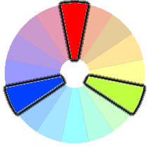
Eigentlich sind die Segmente keine Farbverläufe, da sie nur aus einer Farbe bestehen. Um aber eine scharfe Abgrenzung der Farbe zu bekommen, ist die 'transparente' Farbe auf 1% gesetzt worden. Eigentlich sollen die stop Werte aufsteigend sein aber hier wird absichtlich der Farbverlauf verhindert. Die Einstellung der stop Werte für die Farbe wurde empierisch ermittelt. Die Farbkanten sollten sich bei gegebenem Winkel im Zentrum treffen.
Actually, the segments are no gradients, since they consist of only one color. But to get a sharp demarcation of the color the 'transparent' color is set to 1%. Actually, the stop values should be ascending but here the gradient is intentionally prevented. The setting of the stop values for the actual color was determined empirically. The color edges should meet at a given angle in the center.
In der Vorschau angezeigte Ellipse stimmt nicht mit der Farbfläche überein. Grund: die stop Werte bei den Farben beziehen sich auf die x-Achse. Ist also der stop Wert größer als der x-Radius (rx), ist auch die Farbfläche größer.
The previewing ellipse does not match the color space. Reason: the stop values for the colors refer to the x-axis. Thus, if the stop value is greater than the x-radius (rx), the color space is larger.
URL-Definitionen im background-image werden bei den Gradieneten mit berücksichtigt. Um mehhrere zu testen, auch in Kombionation mit Farbverläufen, kann man alle vorab in der CSS-Definition angeben und dann mit dem OFF Schalter einzel einschalten.
URL definitions in the background-image are taken into account for the gradients. To test several, also in combination with color gradients, you can specify all of them in advance in the CSS definition and then switch them on individually with the OFF switch.
--- Hinweis ---
--- comment ---
In der Taskleiste erscheint ein zusätzliches Browserfenster. Dieses ist außerhalb des Bildschirmes positioniert und ist intern nur für den Focus der Dialogfenster aus dem Panel in der Webseite erforderlich.
An additional browser window appears in the task bar. This is positioned outside the screen and is only required internally for the focus of the dialog windows from the panel in the website.
 angedeutet wird. Die darunter liegenden Felder zeigen die Hintergrundfarbe und die Vordergrundfarbe. Das Feld mit dem roten Kreuz
  (und Tasten
  , welches Element einen Hilfetext hat. Ein Klick auf das Element zeigt den Hilfetext. Nach einer Zeit oder durch Berührung des Hilfetextes mit der Maus, wird der Hilfetext ausgeblendet. Die Taste
  mit maximal 5 Buttons. Mit Klick auf einen Button wird ein Dialogfenster in den Vordergrund geholt. Der letzte Button beendet das Addon. Das Panel kann mit der Maus verschoben werden.
 ,
,  und
und  dargestellt. Durch Drücken einer Schaltfläche wird das Div Element aktiviert und die grauen Flächen des Box-Modells sind diesem Element zugeordnet. Mit der Schaltfläche des Elementes in der Mitte